If you’ve just visited zapsplat.com for the first time in a while, you might notice some big changes. Yesterday we launched version 3 of our site after 6 months of hard work. Our users often feedback to us what we do right and wrong and how we can improve our service. So we have been working to fix things and improve based around these suggestions. One of the biggest issues we faced was an out-of-date design and a clunky user interface.
We launched 4 years ago in April 2015 with version 1 of our site and library. Back then it was created as a hobby around my full time work. I always knew the site had potential to become a huge and highly useful resource, but it was build on a shoe string budget and I was the only sound contributor. We started with just 6,000 free sound effects and music tracks. Below is the first ever design of our site.
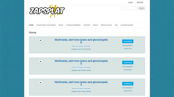
As you can see, the design was very basic as was the functionality. However the main concept of the simple interface that we created back then still exists today. Users could simply create an account for free and start downloading sounds to their computer or device. That was about as far as the user experience went, which, for many is all they need. However it quickly dawned on us that if we were to stand out as a more professional resource, we needed to look more professional. I turned to designers to help create a better looking website with more advanced features. We wanted users to be more engaged with each other, so we built in some social features such as groups and a status timeline, allowing you to post questions, ask for support and feedback on a number of different topics and industry areas. Here is version 2, launched in 2016.
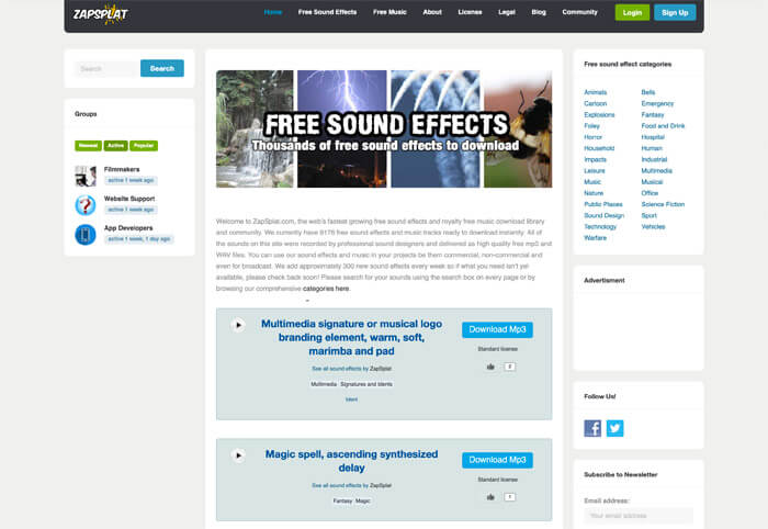
This new design was the basis for how the site looked and operated right up until a couple of days ago from this writing. The three column layout allowed us to display information to users for things such as our social media accounts and the newly added account upgrade, allowing users to sign up for a Gold account. When we first launched Gold accounts, the only benefit was the removal of the attribution requirement, however this quickly grew into other features you see now, including the sound lists and also Gold member only sounds.
There were many changes from 2016 to 2019, but the main problem was the three column layout. User feedback suggested that the most important content was our sounds and dedicating as much space to those on the page as possible would help people find out more info about each, as well as making the browsing experience more comfortable.
Introducing version 3
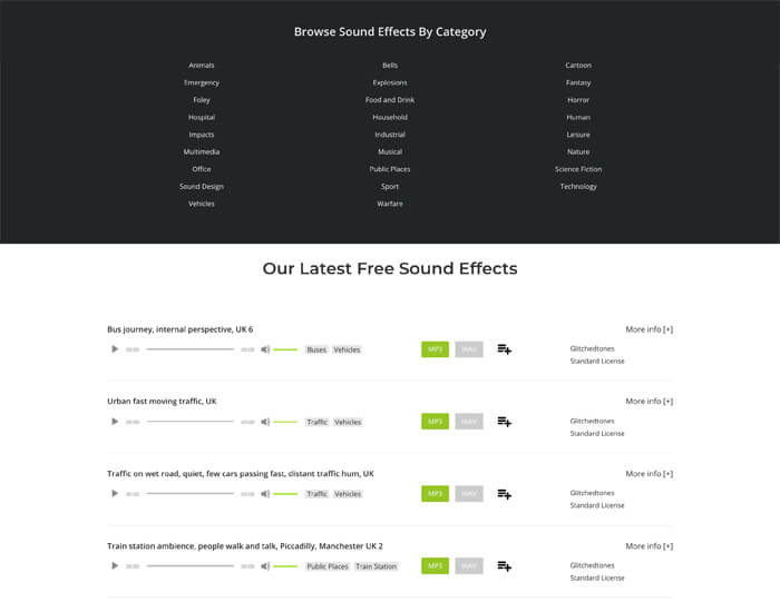
While the screenshot above doesn’t show you the full extent of the design changes we made, it does show you our thinking around how we wanted to display the most important content on our site, the sounds themselves. Our streamlined design now allows the sound results to stretch right across the page, allowing us to use a bigger font for descriptions while not cluttering up the result with items on two or three lines. Descriptions are now limited in characters, but are fully expandable with a ‘more info’ button. This also shows the keywords for each sound which we felt only relevant to users who are interested to know more.
The colours we use are now simpler (we only have 4 colours throughout the site) and each colour represents it’s own function. Green for downloads, blue for pagination gold for Gold features and a lighter blue for links. Contributor profiles are now also wider, leaving space for some new features we have planned for the very near future.
Search within categories
We had hundreds of people ask us to include more search filters. One of the main requests was the ability to search within a category or set of categories. This is highly useful if, for example, you are looking for a science fiction gun sound and want to filter out all the real weapon sounds. Or if you are looking for the sound of a whoosh for a radio production element and want to listen to only sounds in that category. Below is a screenshot of that search module, which you’ll find on most of the site pages.

We have many more advanced search filters planned and phase 2 of the latest development will start soon. This will also include extra benefits for Gold members, extended contributor functionality and more. We hope you like the new look and welcome any feedback, good or bad. If you find any bugs, please also let us know.

Comments are closed.